


Work Samples Prepared for: Aspen Vodka
Work Samples
Case Study
View Creative Samples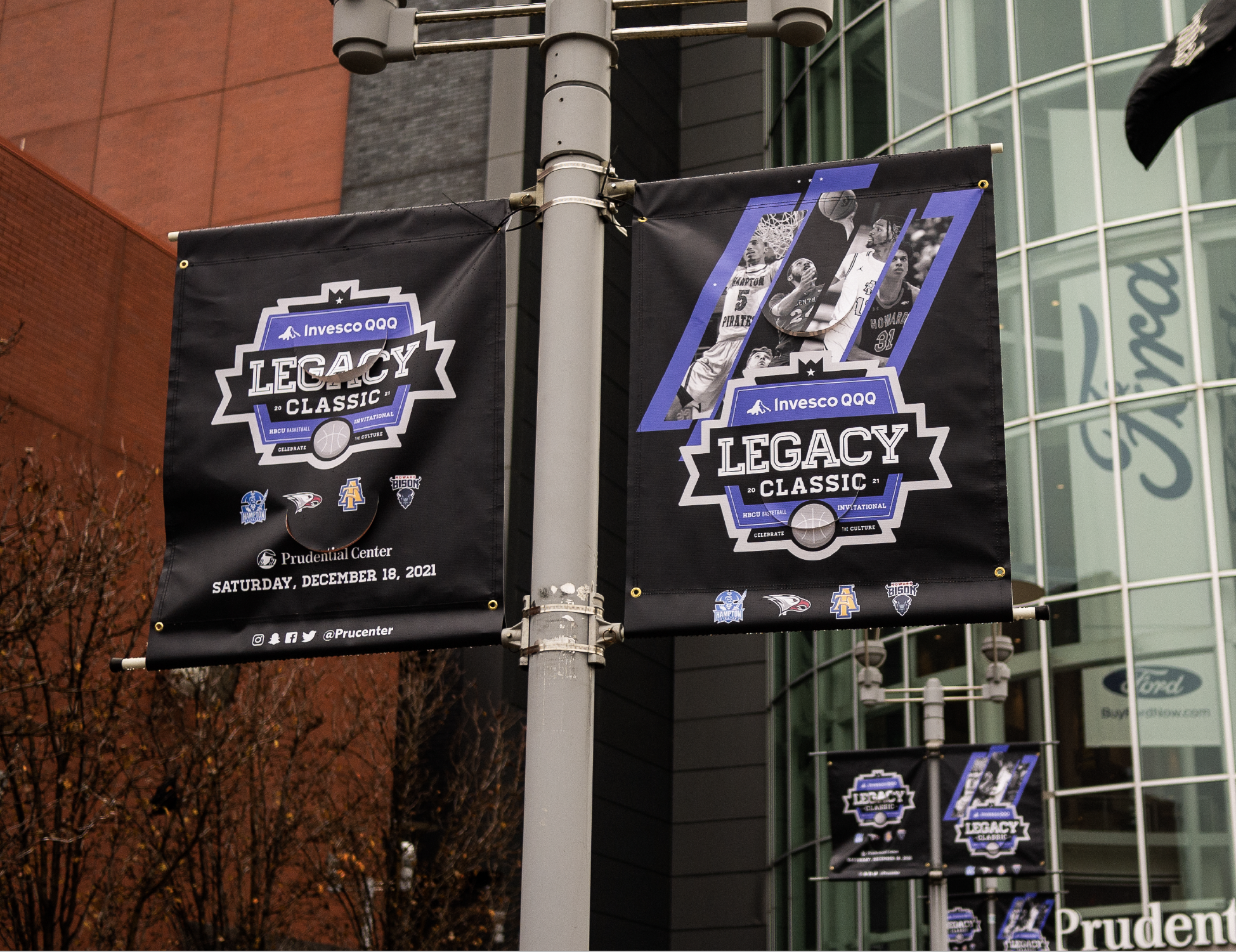
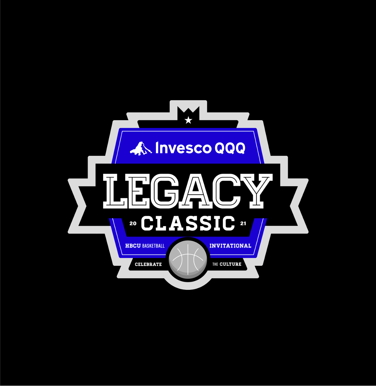
Invesco QQQ Legacy Classic
SITUATION
Historically, HBCUs have not been given the level of exposure and platforms as PWIs as it relates to both academics and athletics. Alongside WME client, Michael B. Jordan, Endeavor wanted to build an inaugural live celebration of HBCU culture, academic excellence, and athletics. Inviting HBCU communities of students, families, alumni, and prospective students to an in-person weekend showcase while also broadcasting our message nationally.
SOLUTION
160over90, Obsidianworks, and teams across Endeavor worked together to create a purpose-driven event at the intersection of sport, advocacy, education, and culture. Not just a basketball tournament, the Invesco QQQ Legacy Classic became a cultural weekend advancing HBCUs through events such as a Career Summit, an eSports Tournament, a Startup Pitch Competition, and a musical performance by WME-client, Cordae. The host city, Michael B. Jordan’s hometown, Newark, NJ, was fueled with economic and educational opportunities – exposing high school students in the northeast to all that HBCUs have to offer.
The 160over90 and Obsidianworks team built the overarching brand strategy and oversaw marketing, creative, logo and brand development, digital content, ancillary programming, and social impact for the event.
RESULTS
The inaugural event garnered more than 1.5MM impressions on social media.
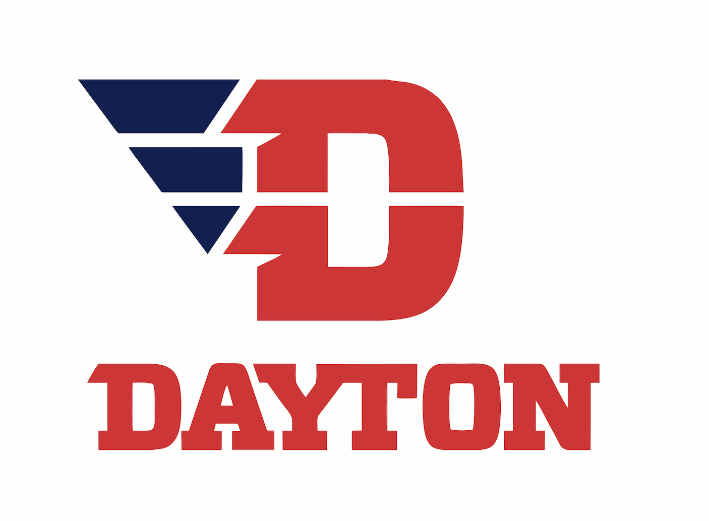
University of Dayton Athletics
View Creative Samples
University of Dayton Athletics
For decades, the University of Dayton (“UD”) enjoyed unwavering support from some of the nation’s most dedicated fans. Fans who have been there through the highs and lows, and who continue to pack their 13,435-seat arena. To repay this loyalty and to ensure it for future generations, UD made an unprecedented investment to elevate the program through the quality of recruits they attract—and they tasked 160over90 to develop a new brand identity that would support their efforts.
In 2014, following a successful men’s basketball season, 160over90 worked with the university to create a new athletics brand built around a cohesive message—To Every Challenge We Rise. The brand showcases the pride, persistence, determination, and passion infused in Flyers’ sports while drawing visual cues from UD’s history and vision for the future. As a whole, it shows the Flyers as a formidable force that will only rise higher.
To bring the athletics visual identity to life, our team developed a brand that would fit under the overarching UD brand and attract a higher quality athlete and elevate the program to elite status. The new logo is adaptable across all athletic environmental branding mediums, from digital and broadcast, to court and stadium signage, to uniforms and apparel. Specifically, our team created in-stadium graphics, print advertising, and outdoor advertising, in addition to branding the team’s locker room and arena, and developing an athlete-recruitment microsite and uniforms for the Flyers.
Case Study
View Creative Samples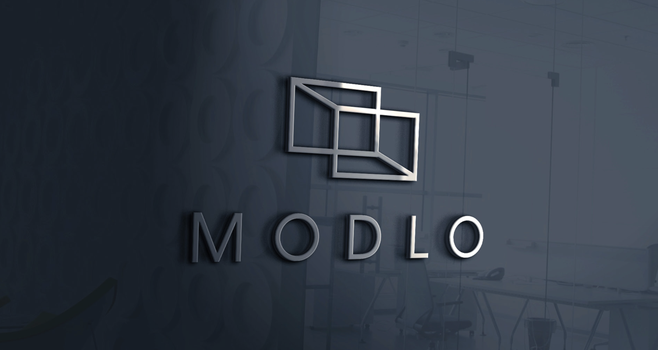
Modlo
Situation
Modlo is the logistics real estate operating platform of GLP Capital Partners (“GCP”)—the largest private equity investors for logistics space and technology-led solutions with a global reach and operations in China, Japan, Brazil, the United States, and Europe.
Modlo operates a growing national portfolio of sustainable industrial properties while providing logistics expertise. From acquisitions, leasing/property management, and bulk distribution to last-mile delivery—Modlo approaches every relationship with a unique people-first attitude, aiming to understand each customer’s unique requirements and working to help them strive for high performance for their key stakeholders and best-in-class experiences for their workforces.
Solution
GCP’s leadership recognized the need to legitimize the company’s core offerings and further define its B2B reputation outside of the Asian markets in order to methodically solidify its U.S. business and reshape perceptions.
As such, GCP approached 160over90 to assist with naming, branding, and launching an entirely new warehouse and logistics company in the market. We ultimately settled on the name Modlo—short for Modern Logistics—and developed a new logo and visual identity system for the organization.
From there, we helped roll out the brand identity across OOH, collateral, stationery, environmental and warehouse signage, truck branding, employee uniforms, social media, and website.
Results
Following the launch of the new brand platform, Modlo’s internal stakeholders fully adopted the new brand identity, and implemented the visual expression across all marketing channels/touchpoints.
As of June 2022, 160over90 is in the process of enhancing Modlo’s website to further drive brand awareness/recognition and conversion of leads in the company’s sales pipeline.
Case Study
View Creative Samples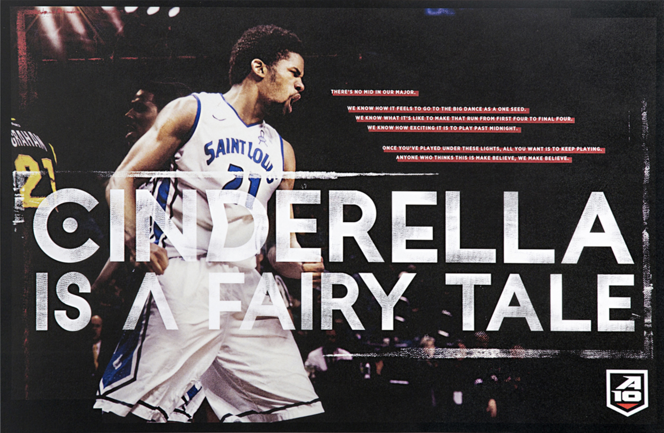
Atlantic 10 Conference
Situation
Despite a consistent record of beating teams from so-called power conferences, the A-10 was still perceived as a “mid-major.” After immersing ourselves in the brand, we realized that what binds A-10 teams together is the belief that wins can only be earned through hard work. Our repositioning would herald the end of basketball dynasties resting on their laurels with the idea, “Winning championships is a workright, not a birthright.”
Solution
The brand we developed tells the world, “We’ve got next.” We launched the Next campaign via a powerful 2-minute manifesto commercial that re-energized the existing fanbase and got everyone talking about the conference. This commercial became the cornerstone for a wide-ranging integrated campaign, resulting in tens of millions of impressions and a vastly different perception of the A-10 by sports commentators and peer conferences. We kept the forward momentum with the bold evolution of the Atlantic 10’s identity.
Results
Our work for the A-10 has been recognized with a CLIO Award for integrated campaigns, and was covered by The New York Times and Sports Illustrated. To date, WhoWantsNext. com has over 2 million Twitter impressions, over 4 million social impressions and over 48 million total media impressions.
Case Study
View Creative Samples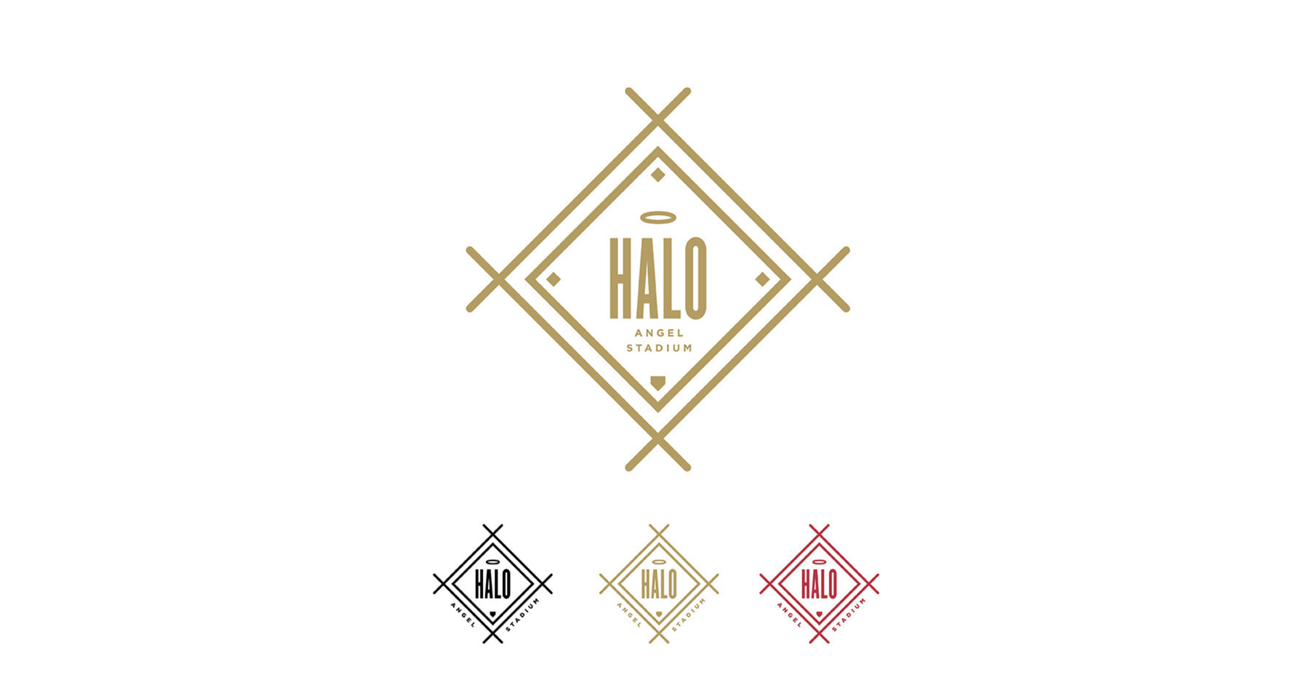
LA Angels
The Los Angeles Angels of Anaheim partnered with us to create a name, identity and design experience for its new luxury seating section.
Situation
After a yearlong delay, the Angels were ready to unveil a new seating section. They transformed their old press box into one of Major League Baseball’s premier experiences. Right next to the owner’s box, the section featured all-inclusive, globally inspired dining, a highly attentive personal staff and the best sight lines in baseball.
Solution
Knowing that the Southland is not so much a sports town as it is an events town, we created a look and feel to reach the socially savvy Orange County crowd. Dubbing our audience the “Scenesters,” we started with naming the space HALO, then built a brand, identity and aesthetic to appeal to those who expect a certain level of accommodation, service and exclusivity. It’s baseball, but with a polished, airy lounge-like atmosphere. We wanted everything to have a premium, considered feel — from the sales materials to the tickets to tiny surprise- and delight-moments on coasters and glassware to a photo wall backdrop for entering guests.
Results
Before 160over90 branded the space, it was 40% sold. Within a month of the brand launch, HALO was 100% sold out for the season. Since then, the space has garnered early deposits for next year and helped the Angels secure top-flight sponsors for the space.
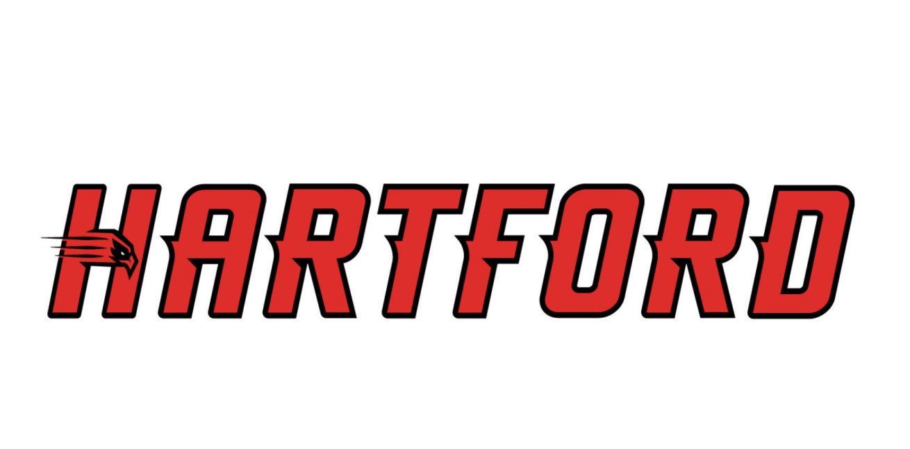
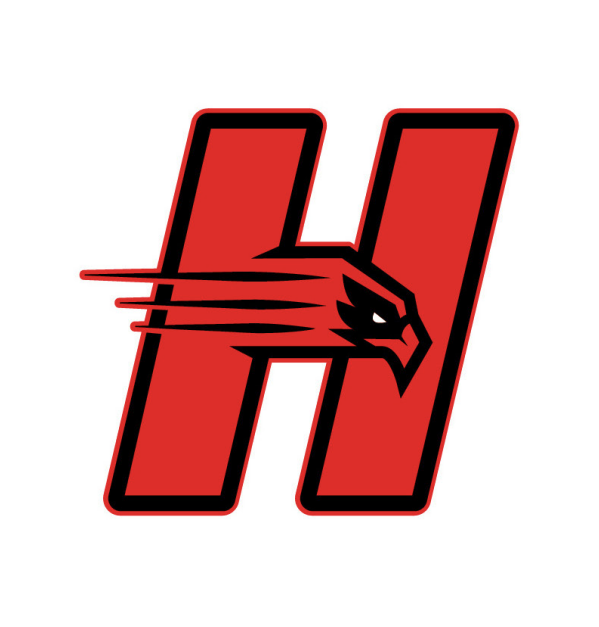
University of Hartford Athletics
View Creative Samples
University of Hartford
Situation
Ever since its founding in 1957, when three schools came together to form the University of Hartford, distinctness has been central to the institution’s story. When we set foot onto Hartford’s central quad, that distinctiveness stood out literally—no two buildings look exactly alike. But we also got to see that distinctiveness in all that the institution offers students across more than 100 programs of study. And we also found that, regardless of the program, Hartford was offering a distinctive experience to its students: an uncommon focus on undergraduate teaching that helps bring out the very best in each and every student.
Solution
The more we learned and discovered, the more we realized Hartford had a great story to tell. Every professor we spoke to, every dean, every coach—everyone shared great examples of how they are helping students tap into their potential to become better versions of themselves. And this story was emblematic of the institution as a whole. After all, Hartford is the young upstart among New England’s private universities. It’s a little rough around the edges, from its concrete and brick buildings to the honesty and candor of its professors.
We leveraged this persona to tell the greater university’s story while making it relatable to the very students and prospective students it serves. The brand’s voice took on the tone of a mentor—a voice that flexes from trusted advisor to wise professor and motivational coach, offering just the right blend of challenge and support. To bring the brand to life, we partnered with architecture firm Ambit to reimagine and redesign the spaces of Hartford’s admissions house. We developed specialized recruitment pieces for Hartford Art School, as well as a viewbook for the entire university.
We infused the brand’s messaging into the university’s campus—its sidewalks, cafeteria, athletic facilities and campus store, all delivering the same branded story—Hartford University is “distinctive by design,” and its approach develops especially distinguished graduates.
After completing a comprehensive university-wide branding engagement, 160over90 focused on building a new University of Hartford athletics brand to better reflect the school’s ambition and character. Our athletics efforts began with a targeted discovery which informed a strategy and approach for the rebrand and logo design. Our creative team then built out an entirely new logo and logo system for athletics; created a custom font; and rolled out the new logo across uniforms, locker rooms, center court, team busses, posters, and more. We also delivered an extremely comprehensive set of athletic brand guidelines for anyone who would touch the athletics brand in the future.
Results
Following launch of the new brand, the university climbed 15 positions in the U.S. News & World Report’s Best Colleges Rankings from 2013-2014. Our work was also recognized in publications such as How International (Best In Show), Graphis, Print Magazine’s Regional Design Annual and Under Consideration (Best of 2014).
- Undergraduate applications increased by 10%, the most in school history
- Undergraduate deposits increased by 18.5%
- Applications for the Hartford Art School increased by 27%
Case Study
View Creative Samples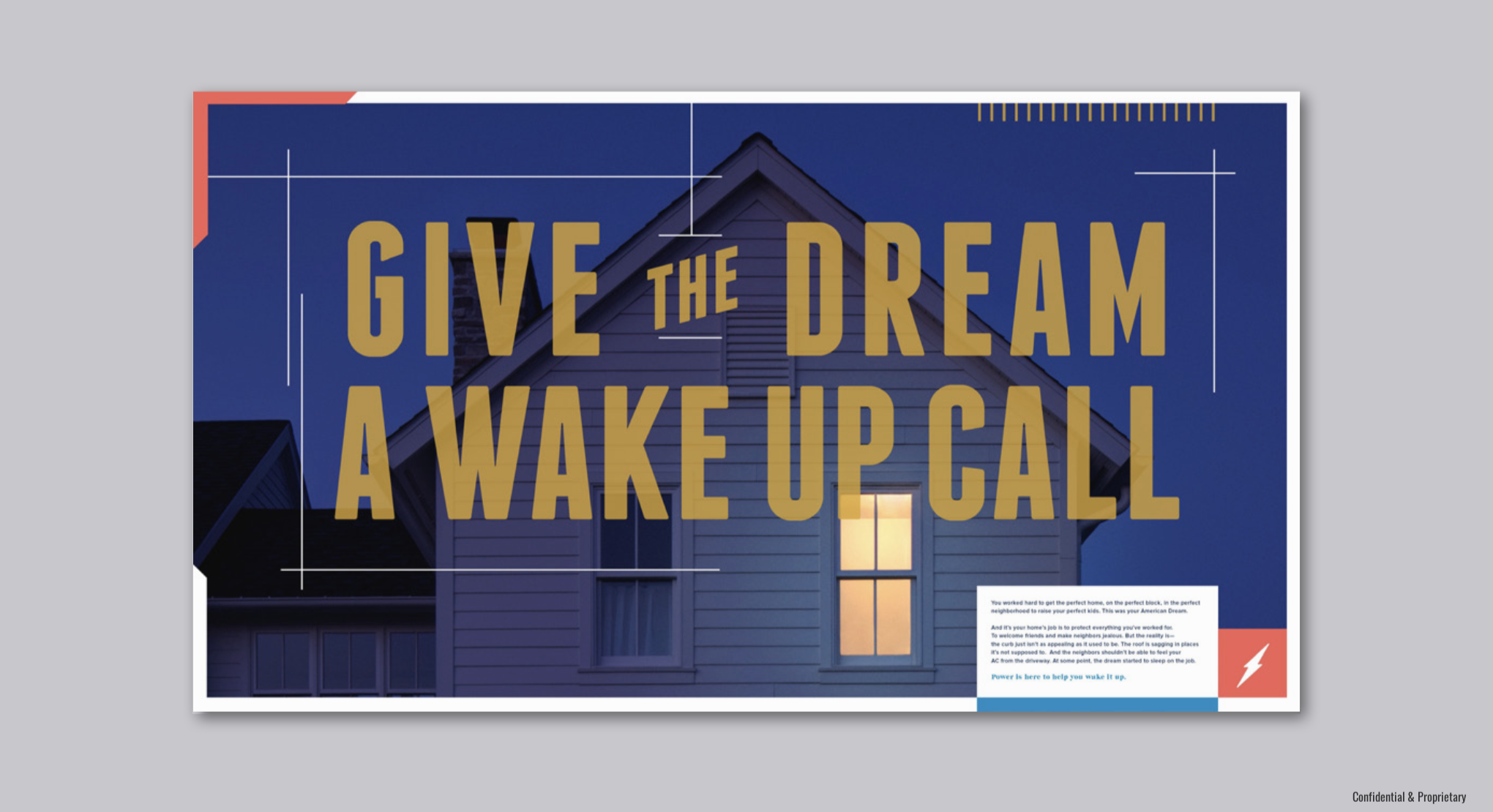
Power Home Remodeling
Situation
Founded in 1992, Power Home Remodeling is an American corporation headquartered in Chester, Pennsylvania that provides energy-saving and environmentally friendly exterior remodeling solutions: replacement windows, siding, entry doors, roofing, attic insulation, gutter protection, and solar panels.
Over the paste decade, Power Home Remodeling experienced rapid growth under the tenure of Corey Schiller and Asher Raphael, the company’s current co-CEOs—increasing annual revenue from $100M to $700M in annual revenue.
Solution
In an effort to drive awareness and sales, Power Home Remodeling approached 160over90 to refresh the company’s brand narrative and visual identity.
160over90 began with a Discovery phase to audit existing brand assets, and uncover key insights and anecdotes across the Power Home Remodeling community. Additionally, we conducted a competitive audit across the home remodeling landscape to better understand how organizations like Home Depot, Lowe’s, and Pella engaged with customers.
From there, 160over90 distilled the Discovery findings into a new Brand Strategy centered on the idea of “Relentless Dedication To Improvement”—which embodied Power Home Remodeling’s commitment to its people, products, and sustainability efforts.
We ultimately developed a new brand architecture and visual identity that encompassed Power Home Remodeling’s multiple services across windows, siding, roofs, and doors.
160over90 also refreshed key marketing/communication channels across print, collateral, advertising, trade show booths, digital, social media, video, and a new website aimed at driving sales and recruiting new team members.
Results
Following the launch of the new brand platform, Power Home Remodeling’s internal stakeholders fully adopted the new brand identity, and implemented the visual expression across all marketing channels/touchpoints, and saw an increase in sales/recruiting through the company’s new website.